Contour Maps
How contour maps display information
 Figure 1
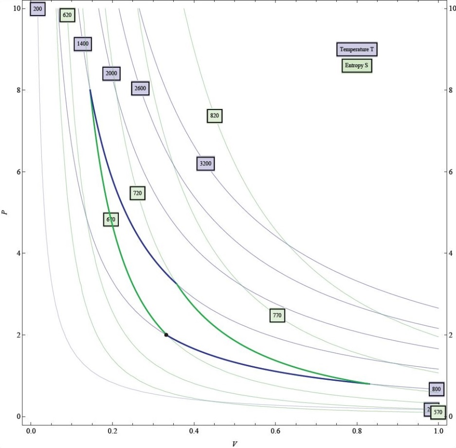 Figure 2
A contour graph shows the relationship between three variables using only two dimensions, as shown in Fig. 1. Two variables lie along the horizontal and vertical axes (xand y in the figure), while the other variable (V) is represented using curves along which that variable is constant. It is then possible to read information quickly: *e.g.,*where the value of V is high or low or where it is changing quickly or slowly. The canonical interpretation of a contour graph (as might be taught in multivariable calculus) is that the variable V is a function of x and y. In experimental contexts, however, one might construct a graph like Fig. 2, which shows pressure (p) vs. volume (V) collected at several different values of constant temperature (T). Although this can still be interpreted as a contour graph, it can be thought of as one of the axis variables expressed as a function both of the other axis variable and of the variable which is held constant. This usage of a contour graph is not commonly taught in mathematics courses, but may be used heavily by professional scientists.
Derivatives
Derivatives can be found from a contour graph in many different ways, which may depend on how the graph is to be interpreted. For example, in graphs like Fig. 1, a derivative of V can be found with respect to any variable and in any direction, including x and y, by choosing two points on adjacent contour lines and dividing the change in V by the corresponding change in, for example, x or y, where the perpendicular direction is typically held constant. The value of such a derivative can also be compared at different points by examining the density of the contour lines. A vector quantity like the gradient can also be found.
Derivatives like the one described above can also be found for the graph in Fig. 2. However, it is also common to find the derivative of p with respect to V, holding T (or another variable) constant. Such a derivative can be found either by choosing points and computing a ratio of small changes or by sketching a line tangent to the constant temperature curve and computing its slope.
Affordances and limitations
Contour graphs are flexible. The number of contour lines drawn can be changed to alter the resolution. The different curves or the regions between the curves can be given different colors. In cases where there are more than three variables, but only two independent variables, contour graphs for different variables can be overlaid using different colors or line styles, as in Fig. 2.
However, contour graphs do not generalize well to functions of three or more variables. They necessarily cannot convey the exact value of V at every value of x and y, information that is carried by a representation like a plastic surface.

The magnitude of the derivative of a function is directly related to how close together the contour lines of the function lie: the closer together the contour lines, the greater the magnitude of the derivative.
As adjacent contour lines represent equal changes in the function, the denser the contour lines, the quicker the function is changing. Therefore, the magnitude of the gradient is greater where the contour lines are denser.
As the gradient lies along the direction of greatest change for a function, and contour lines lie along the direction of no change, these two objects (the gradient and contour lines) are perpendicular.