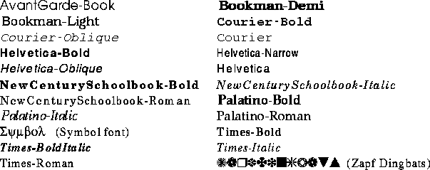


As with other computer fonts, PostScript fonts are numerous and take up too much space. There are several basic and familiar fonts and hundreds more that many feel they must have. Unless you really have a specific need or exotic tastes, the basic fonts will probably be adequate. Printers generally come with a basic dozen or so fonts, with the actual number depending a lot on how you count. There are hundreds of additional fonts for those who feel they must have more to be complete.
Some common PostScript fonts are:

A fundamental difference between PostScript fonts and others, such as X or Macintosh fonts, is that PostScript fonts are defined by their outline. What is stored is not a map of the bits making up the actual characters, but rather a description of how to draw them, or more precisely, their outlines. The advantage of outline fonts is that they can be precisely scaled to an infinite number of sizes, even factional sizes, and still look good. Fixed size bit map fonts, in contrast, are harder to scale and often contain rough corners. Outline fonts are drawn with the full resolution of the printer instead of the fixed resolution in which the bit map was created. This book was set using PostScript Times and Helvetica fonts rather than the LaTeXComputer Modern Fonts. Therefore when we printed the final draft on a 1200 dots-per-inch PostScript printer, everything looked the same, only smoother, than our normal 300-dots-per-inch low resolution printer.


